
Digipak Development
- Evanna Berindei
- Apr 18, 2022
- 1 min read

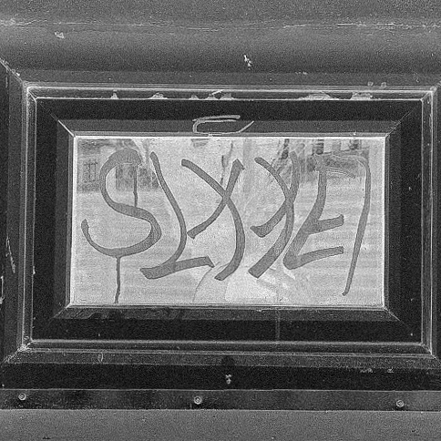
We had a short photoshoot for the digipak - as we already had a decent amount of photos taken while we filmed our MV. However, it was useful to have wide variety of pictures to choose from.

These are the raw versions of the four photos we selected to use for the cover, inside and back of the digipak.


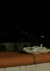


In order for these photos to achieve a mutual feel and visual style, they each had a very similar editing process, consisting of turning them monochrome (and adding a negative filter on the graffiti and shore pictures) alongside adjusting the lighting curves to have a more dynamic feel. Grain was a finishing detail that really solidified and united all of these images together, it brings a unity with it.


Below are the 3 main fonts we initially thought to use. They each have a different personality that differs from the rest. After further discussion we realized none of these fit our creative vision therefore we researched further. They just didn't represent our message well enough.

Finally we found "Microsoft Yi Baiti", its simple and slick, accompanied by a softer color could prove perfect for our digipak.


Comments